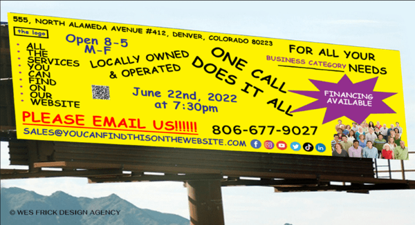
Did you see Wes Frick‘s LinkedIn post, “What Not to Do on a Billboard?” Hopefully you didn’t see yourself in that picture! Wes’ mythical billboard has it all going on – but not in a good way. It’s not eye-catching, it’s eye-crossing. In fact, it’s a mess. It “features” 14 different visual elements. Fourteen! None of them stand out, so all of them are lost.

“These are all things that people do that take away from focusing on one idea,” Wes points out. “When multiple ideas are presented, it’s more to decipher.” Even if you aced your speed reading course, you couldn’t possibly grasp all this information in just a couple of seconds driving by. The message here is crystal clear: if you cover your billboard with Too Much Stuff, it will fail in every way, wasting your marketing budget on mal-designed content.
For billboards, less is more
Billboards can transform the effectiveness of your digital marketing, but they do cost money so you don’t want to blow the opportunity. As a professional billboard design consultant Wes Crick knows what (not) to do. “In order for a billboard to truly be effective, you really have to get the message across in 2-3 seconds even though the viewer may have 5-7 seconds to read it.”

So where does this board go wrong?
Some things just don’t belong on a billboard
- Statements such “for all your (business category) needs” and “one call does it all” are not only trite, they don’t inform or inspire your audience in any way.
- “Locally owned & operated” may be true and something your audience cares about, but it is also very general. On the other hand, your local status could be a significant selling point, especially if you have strong non-local competition, but if you bury that fact among myriad other “key” points it will get lost. Leave it off unless you’re doing a “buy local” campaign.
- A billboard is not your website, email signature or stationery. Your physical address, phone number and hours of operation belong on your website and your online listings, not a billboard. On the other hand, if the purpose of your billboard is to launch a new store location, then the address may be your primary visual. In most cases, you can skip the city and certainly the ZIP.
- Unless you’re promoting an upcoming event, details like the date and time are unnecessary. To announce an event, “June 22” would be sufficient.
- Bulleted lists of services belong on your website and in your blog.
Irrelevant graphics muddy the water
- Branding is critical, so flaunt your logo, don’t treat it as an afterthought. And unless your logo is instantly recognizable, add your name.
- The purple starburst is eye-catching, but the text it’s supposed to emphasize is too small. More on point, both the star and the text are extraneous. Graphics are great, but only if they illustrate your key marketing message.
- So who are all those people? The right photo can carry the day, but leave your team back at the office and post their pix on your website instead.
- Social icons belong on your website, your business card and in digital marketing where you can actually link to those pages.
- QR codes are hot right now. But even if you go bigger than the teeny tiny presentation in this example, it is nearly impossible for someone to capture a QR code while driving by. (That said, QR codes can be golden in other types of out-of-home advertising.)
No viable CTA
The email address and phone number hint at a call to action, but they fall flat. No one will remember that r-e-a-l-l-y-l-o-n-g email address, and even if someone did manage to memorize the phone number, this billboard doesn’t say who they should call or why.
Dumb mistakes
All-caps are hard to read, non-critical punctuation adds clutter, and this billboard even has a TYPO. Can you find it?
Doing it right

So what does a great billboard look like and how can you create one?
- Tell them who you are (your logo and brand name)
- Make one key point (the reason for your campaign)
- Tell then what how to respond – a short URL, for example, that is easy to remember or something like “take the next exit”
In other words, if it isn’t mission-critical to your ad campaign goal, leave it out. Getting billboard content just right requires some thought. We’re here to help, with tips for successful design and a discussion of what it takes to reach an audience that is literally on the move.